The colour of your social media emoticon could be crucial when it comes to your message being interpreted correctly, according to a new scientific study.
And if you use the wrong colour, you’re more likely to ‘mislead’ the person you’re communicating with.
That’s according to new research by experts from Liverpool Hope University, UK, and Joshibi University of Art and Design, Tokyo, Japan.
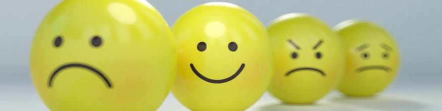
Emoticons are traditionally rendered in yellow, after American commercial designer Harvey Ball in 1969 had created 'smiley' as a yellow button with two black dots for the eyes and a curve for the mouth, upon which many of today’s yellow emoticons appear to be based.
This new study revealed, however, that an emoticon’s colour might affect how an emotional, or nonverbal, aspect of an emoticon’s message would come across, the specialists say.
In this new experimental study, cheerful ‘smileys’ were perceived as ‘happier’ when rendered in yellow or orange, while ‘Angry’ emoticons conveyed stronger emotion when presented in red.
‘Sad’ emoticons were ‘sadder’ when rendered in blue or cyan (turquoise), and ‘Neutral’ emoticons came across best when rendered in grey.
But, on the flip side, ‘Angry’ emoticons rendered in cool colours, and ‘Sad’ and ‘Neutral’ emoticons in warm colours revealed higher chances of being misinterpreted.
The results have been published in the journal i-PERCEPTION.
Lead author Professor Galina Paramei, of Liverpool Hope University’s Department of Psychology, describes an ‘emotional Stroop’ effect at play, whereby the “emotion expression of an emoticon assessed by the receiver is impacted by the emotional sign of the colour it is presented in”.
The authors write: “These findings indicate that incongruent, or contradictory, emotion expression–colour combinations attenuate the message conveyed by the emoticons.
“The resulting ambiguity of a message apparently triggered an ‘emotional Stroop’ effect that potentially could lead to a receiver’s misinterpretation of the context, the tone of the message, or the sender’s attitude – be it a negative bias, flaming the interaction, or a positive bias with spurious peace-making – but ultimately impacting the efficiency of communication.
“The present findings can be useful in developing communication tools in social networking sites to improve the ‘emotion catch-ball’ in digital communications by using emoticons with congruent colour variations instead of conventional yellow emoticons.”
Prof Paramei and her research colleagues, PhD student Songyang Liao at Kanagawa University and Professor Katsuaki Sakata at Joshibi University, in Japan, suggest the phenomenon could be related to how humans are hardwired to perceive colour of expressed emotions in real human faces, or ‘biologically-engrained face coloration’.
Prof Paramei, a respected colour vision scientist, refers to the Biopsychosocial Model of Challenge and Threat (Blascovich, 2013) explaining: “Specifically, approach-oriented emotions – anger, happiness, surprise – evoked by challenge elicit vasodilation, facilitate blood flow to skin areas, with the face becoming redder and yellower.
“Conversely, avoidance-oriented emotions, such as disgust, fear, sadness, triggered by threat, elicit vasoconstriction, reduce blood flow to the face and, hence, incur bluer or greener facial coloration.”
The new research saw Prof Paramei and her colleagues putting around 50 participants based in Japan through a series of four laboratory-based experiments and one online experiment. The volunteers ranged in age from 18 to 23 years old and were both male and female.
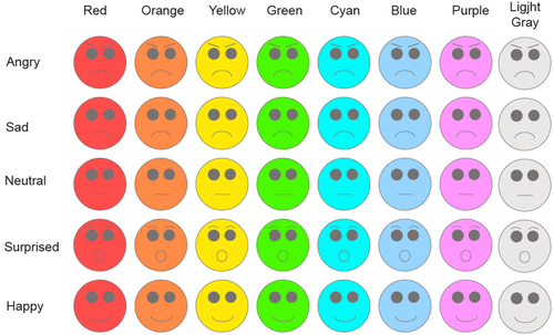
Each test centred on a set of 40 different emoticons representing four basic emotions – ‘Angry’, ‘Sad’, ‘Surprised’, and ‘Happy’, and a ‘Neutral’ expression, which were each rendered in eight different colours, running from red through to orange, yellow, green, cyan, blue, purple and light grey.
The bulk of experiments in the series saw participants assessing the affective meaning of different coloured emoticons before deciding whether the image was ‘Not Angry or Angry’, ‘Not Sad or Sad’, ‘Not Neutral or Neutral’, ‘Not Surprised or Surprised’ and ‘Not Happy or Happy’.
The results were more or less consistent throughout both the lab and the online experiments.
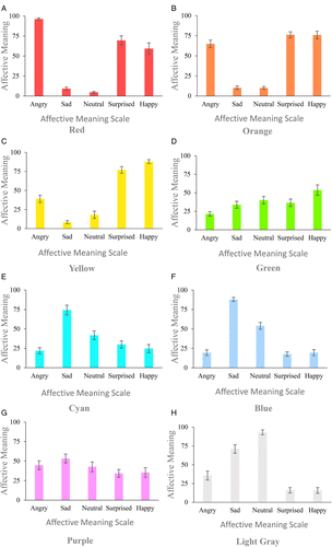
Prof Paramei says: “As is apparent, ‘Angry’ emoticon was perceived as ‘angrier’ in warm colours, particularly in Red and Orange.
“Red ‘Angry’ emoticon had higher Angry affective meaning than in all other colours, and Orange ‘Angry’ emoticon was ‘angrier’ than in Light Grey.
“‘Happy’ emoticon, as expected, was judged ‘happiest’ in Yellow: the corresponding affective meaning was higher than when it was rendered in Purple and Light Grey or Red, Cyan, and Blue. ‘Happy’ emoticon was also judged rather ‘happy’ in Orange, with Happy affective meaning higher than when it was rendered in Cyan, Blue, Purple, or Light Grey. In Green, Happy affective meaning was greater than in Light Grey.
“Conversely, ‘Sad’ emoticon was perceived as ‘sadder’ in cool colours, Cyan and Blue; in both colours, Sad affective meaning was higher than when it was rendered in Red, Orange, Yellow, or Green.
“It is worth noting that Purple ‘Sad’ emoticon evinced a Sad affective meaning estimate that was only marginally lower than when rendered in either Cyan or Blue.
“’Neutral’ emoticon was judged as most ‘neutral’ in Light Grey, with the corresponding affective meaning significantly higher than in Red, Orange, or Yellow.
“Finally, ‘Surprised’ emoticon appeared to slightly better convey the intended emotion when rendered in Red, higher than in Blue, in accord with findings for realistic face images.”
For the Japanese respondents, Professor Paramei and her colleagues found that, on average, the colour of the emoticon accounted for a third of the meaning of the emotion attributed to it.
Along with data collected in Japan, Professor Paramei has also tested almost 100 British participants and 60 participants in the USA. A preliminary analysis of data from the three cultures prompts some interesting cross-cultural differences.
Speaking about those separate findings, which weren’t published as part of this study but which are due to be reported on in the coming months, Professor Paramei remarks: “In the US dataset, we actually see no effect of colour. The emotion expressions of the emoticons were read regardless of which colour they were rendered in.
“The British dataset brought another surprise: we had anticipated that results from two Anglosphere cultures would be similar but it appeared that British judgements fell somewhere in-between the Japanese and US, being closer to the Japanese.
“How do we explain this difference?
“It is possible that an explanation could be provided by Edward T. Hall’s theory of ‘low-context’ vs. ‘high-context’ cultures. The theory characterises culture-specific rules of interactive communication in social encounter, whereby in low-context cultures the communication is straightforward and direct, with information vested in explicit codes but is the opposite - indirect, euphemistic, “camouflaged” in high-context cultures, i.e. with heightened awareness of subtle indirect messages.
“On the one extreme is the Japanese culture, which is a high-context culture, while on the other extreme is the US culture.
“To my impression, English communication rules allow to characterise the culture as ‘medium-context’, i.e. it falls somewhere in-between the US and Japanese cultures, as I find Brits to be euphemistic, metaphoric, ‘beating around the bush’, rather than being straightforward in their communication.
“What it means is that in Japanese communication it’s very important to take into account subtle, non-direct, non-verbal cues.
“The Japanese may particularly heed to the colour of the facial skin of their vis-à-vis: if it becomes redder, this may signal that the vis-à-vis is embarrassed by what one is saying or how one is behaving, but would never express this directly, since the Japanese culture discourages overt display of negative emotions.
“So, you can see why the colour of emoticons could be so important in Japanese culture, when it comes to reading cues that are subtle but very important for communication.”
** Joshibi University of Art and Design